|
As one of my many coursework projects for the UCLA Master of Applied Geospatial Information Systems and Technologies (MAGIST) program, I practiced different methods of image classification. 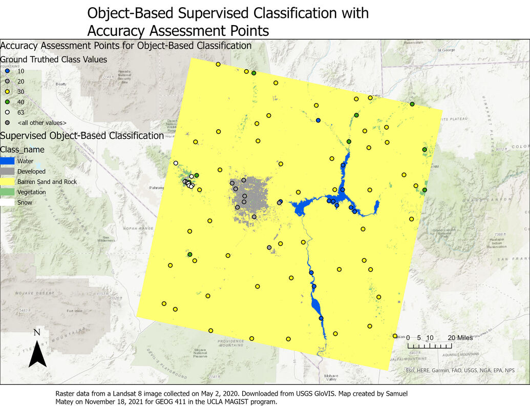 The supervised object-based classification result is considerably more accurate than the supervised pixel-based classification result. This is apparent by comparing the confusion matrices: the object-based classification result has consistent higher user and producer accuracy (i.e. fewer false positives and false negatives).
This also makes intuitive sense based on a visual comparison of the two classification results. The pixel-based classification has several other inaccuracies clearly visible just from a visual survey of the map: for example, multiple patches of sand and rock are classified as “developed”, shown on the map as wispy gray patterns distant from any actual settlement. This seems to be a somewhat “organic” error, reflecting real-world similarities as opposed to errors in training data; scrutinizing the Landsat image reveals that there are many areas of gray sand and rock, particularly dry river beds, that are extremely similar in hue to roads and other paved impervious surfaces in developed areas. That error is nicely avoided by the object-based classification. I considered and reconsidered my choice of classes for the Landsat image, opting to focus on the most clearly distinguishable aspects. The “barren sand and rock” category was so extensive, encompassing everything from gray sandy riverbeds to bright whitish sand patches to gray and ocher rock formations, that I wondered if I was making a mistake by lumping all of these features together. However, I couldn’t come up with a defensible subcategorization: the distinct land covers of snow, vegetation, human-created development, and water were clearly identifiable as separate entities, but the vegetation-free sand and rock that dominated the landscape seemed to occupy more of a spectrum, both in color and texture, in which they were more similar to each other than to any other land cover. Thus, even though it seems surprising that the object-based classification result overwhelmingly consists of the “barren sand and rock” class, I believe this is an accurate categorization of the landscape. As both the object-based and pixel-based classification use a Support Vector Matrix method for reclassification, as well as the same training data, differences between them are extremely likely to be due to object-based/pixel-based status alone.
0 Comments
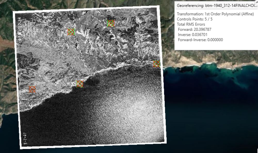 I georeferenced a 1940 black and white aerial photo of part of the coastal area of Santa Cruz Island, California, to the ESRI World Imagery (WGS84) basemap. (The photo source was the UCSB Library FrameFinder archive of historical air photos). The projection is WGS 1984 UTM Zone 11 N. In this "first try" instance, using only a simple first-order polynomial transformation, I created 5 control points (mostly targeting identifiably identical landscape features, like the base of a V-shaped intersection between two cliffs). RMS errors were unfortunately quite high, at 20.396787 forward and 0.036701 inverse. 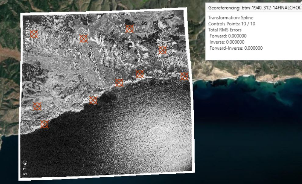 In my second step, with a more statistically robust spline transformation, I created 10 control points (again, targeting identifiably identical landscape features). Impressively, Total RMS Errors were reported to be zero, likely due to the increased complexity and accuracy of the spline transformation compared to the first-order polynomial transformation.
The spline transformation result appears substantially more visually accurate. Using the Swipe tool to view the first-order polynomial transformation reveals several slight “offset” errors, but the spline transformation appears seamless, as can be expected from the difference in total RMS errors. As Esri describes it, the spline transformation uses “a piecewise polynomial that maintains continuity and smoothness between adjacent polynomials” and optimizes for accuracy nearest control points. Here, it appears highly effective 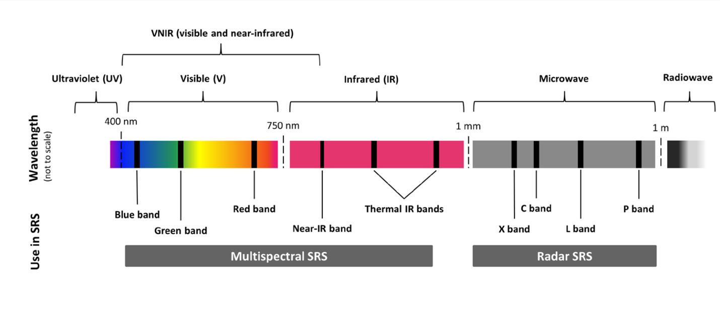 Since September 2021, this writer has been enrolled in the all-online Master of Applied Geospatial Information Systems and Technologies (MAGIST) program at UCLA. Geospatial information systems (GIS), essentially mapping and analysis of all data with a physical location attached, is a key field for understanding and influencing the changing world of the Anthropocene, with potential applications ranging from siting new renewable energy projects to researching temperature, moisture, and biodiversity shifts in ecosystems. As my coursework continues, one project in particular showcased key concepts from satellite imaging: spectral bands and spectral indices. Earth observation satellites (in this example, the latest in America's venerable Landsat program) host instruments that observe, record, and measure light from Earth in specific regions or "bands" of the electromagnetic spectrum. The schematic above shows several commonly observed bands: red, green, and blue in the visible spectrum. 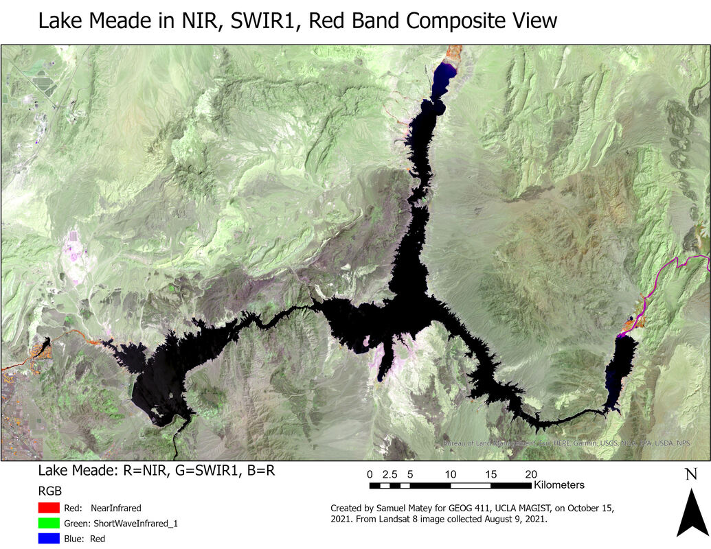 The map above is a false-color satellite image of Lake Mead, formed by the Hoover Dam and the largest reservoir in the United States. The map above looks weird because it's showing light from the Near-IR Band, which human eyes can't see, as red, while showing light from the SWIR1 (Short Wave InfraRed 1) band, one of the two "Thermal IR Bands" on the spectrum schematic above, as green, and finally showing red light as blue. This sort of thing is helpful because different wavelengths of light show different things: for example, due to the physical properties of the chlorophyll molecule, living vegetation is bright in green wavelengths of light (as we see) but is really bright in the near-infrared, so living plants pop out unmistakably if the NIR band is viewed as red on a map. In this case, the band combination was chosen to emphasize the difference between land and water. 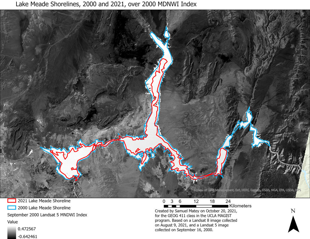 The maps above and below takes it a step further, by using a spectral index, where some math is done to the results of information from different spectral bands to show new and interesting things. In this case, the project used the Modified Normalized Difference Water Index (MNDWI), the equation for which uses the green and thermal infrared bands to calculate a light pattern that enhances the distinctions between water and land even more. In this case, I looked at Landsat images from 2000 and 2021, applied MNDWI to both of them, and did an approximate tracing of the lake's coastlines in both years. (Measurements of water/land boundaries, no matter how good, are only ever better or worse degrees of "approximate," never exact, due to the coastline paradox). 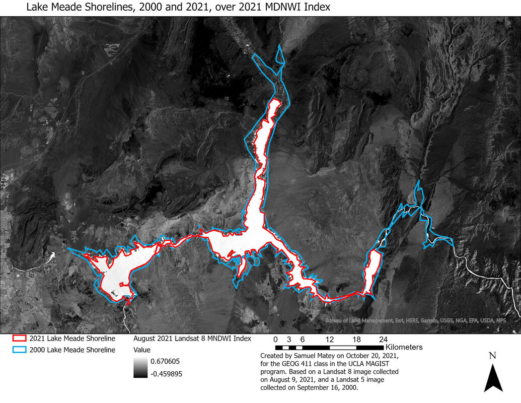 These maps rather clearly show a disturbing consequence of the climate crisis, made worse by mismanagement (particularly overuse by profligate local agriculture) of the Colorado River watershed. Lake Mead is shrinking, profoundly and rapidly. It's now at only 36% of its historic capacity, and rationing, the first ever, will go into effect (for industry/society sectors as a whole, not individual consumers) in 2022. NASA's explainer uses a very similar visualization to the map above. This example is fairly simple, but it's a good illustration of how satellite imaging, and playing around with different sorts of light, can be a source of valuable insight in the Anthropocene-likely a recurring theme in future research and reporting!
|
 RSS Feed
