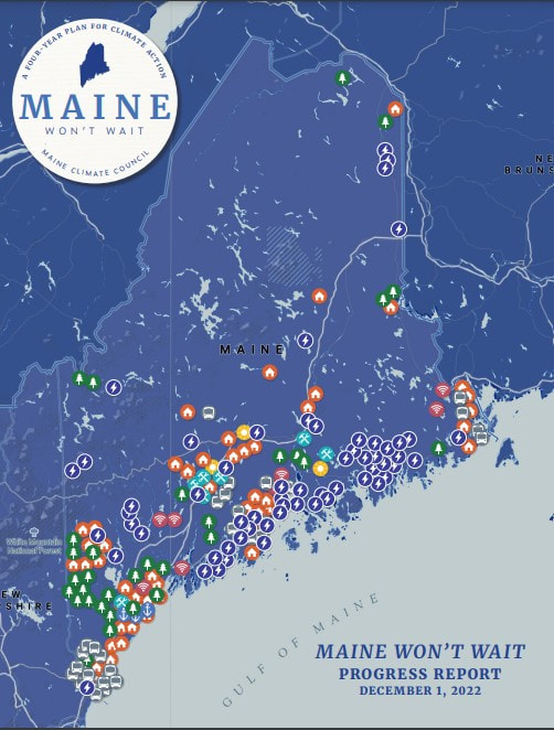
 I created the maps and charts in this report (also used in the dashboard). Full report at
https://www.maine.gov/future/sites/maine.gov.future/files/inline-files/MaineWontWait_2YearProgressReport.pdf.
0 Comments
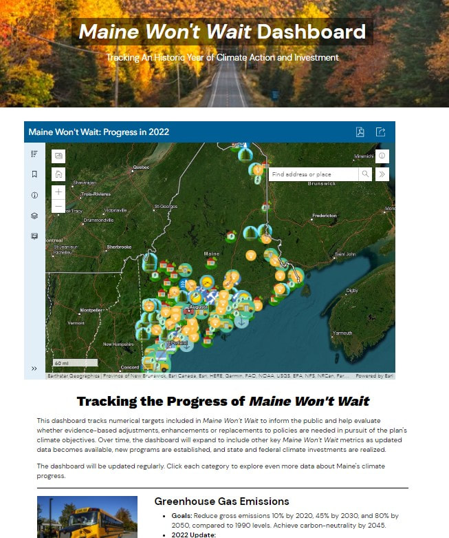 This dashboard (at https://www.maine.gov/climateplan/dashboard) tracks numerical targets included in Maine Won’t Wait to inform the public and help evaluate whether evidence-based adjustments, enhancements or replacements to policies are needed in pursuit of the plan's climate objectives. Over time, the dashboard will expand to include other key Maine Won’t Wait metrics as updated data becomes available, new programs are established, and state and federal climate investments are realized.
I did all of the mapping and chart analysis for this dashboard from September-December 2022 in my capacity as a Geospatial Environmental Scientist for the Maine Governor's Office of Policy Innovation and the Future. 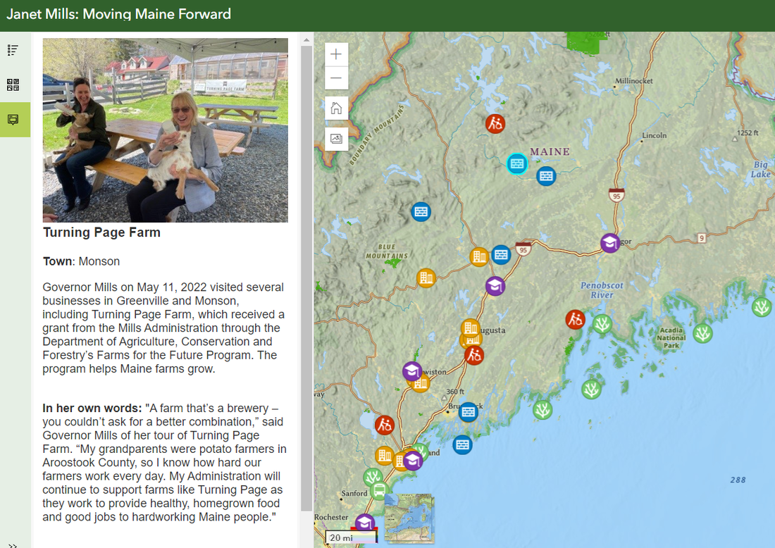 I volunteered my skills to create an ArcGIS Online web app map of Governor Janet Mills' first-term accomplishments for the Janet Mills for Governor re-election campaign. It's available at https://janetmills.com/map/ and https://sammatey.maps.arcgis.com/apps/instant/sidebar/index.html?appid=eff837a8c4f84c8e9a9ed716b673ecbf.
It was Tweeted about by Governor Mills, used on the official campaign website, and received news coverage from the Portland Phoenix at https://portlandphoenix.me/cult-of-competency-mills-maps-out-her-case-for-another-four-years/ These are some simple, early maps I created with RStudio, rendered in Leaflet.js. 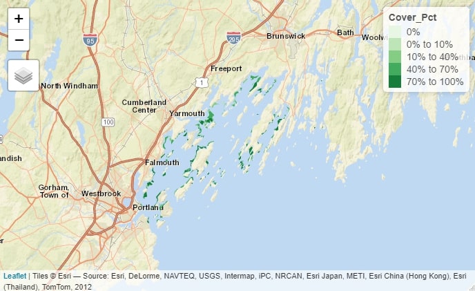 The above map, produced in R's Tmap library, shows eelgrass coverage in Maine’s Casco Bay as of 2018, based on a Maine Department of Environmental Protection dataset and styled with Esri’s World Street Map and a palette of shades of green. R Code Used: > eelgrassdata<-st_read("MaineDEP_-_Eelgrass_2018_(Casco_Bay_Only).shp") >tm_basemap("Esri.WorldStreetMap")+tm_shape(eelgrassdata)+tm_fill("Cover_Pct", palette="Greens") 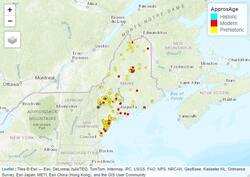 The above map, produced in Tmap, shows major historic, prehistoric, and modern landslides in Maine, based on a Maine Office of GIS dataset and styled with Esri’s World Topo Map and a palette of individually selected colors. R Code Used: > landslides<-st_read("Maine_Inland_Landslides_-_Points.shp") >tm_basemap("Esri.WorldTopoMap")+tm_shape(landslides)+tm_dots("ApproxAge",palette=c(A='cyan', B='red',C='yellow') 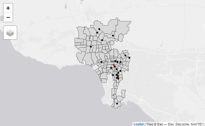 The above map shows criminal homicides in Los Angeles in May 2018. The black points represent homicides, while the red point indicates the spatial mean center of the homicides. Note how the majority of the homicides are concentrated in south and southeast Los Angeles. R Code used: > lacrime110<-lacrime[which(lacrime$crimecode==110),] > tm_shape(lamap)+tm_polygons()+tm_shape(lacrime110)+tm_dots() > la110xy <- cbind(lacrime110$Longitude, lacrime110$Latitude) > la110mc<-apply(la110xy,2,mean) > maplamc110 <- st_sfc(st_point(c(la110mc[1],la110mc[2]))) >tm_shape(lamap)+tm_polygons()+tm_shape(lacrime110)+tm_dots()+tm_shape(maplamc110)+tm_dots(col='red') 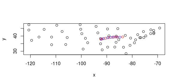 The above map calculates the weighted mean center of the US population for each decade and shows how it has moved, on an x-y plane of state centroids.
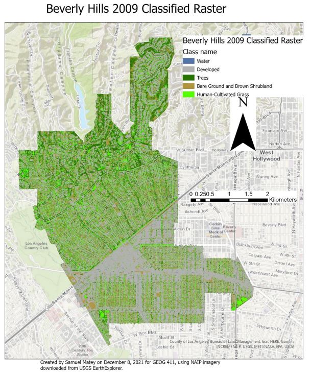 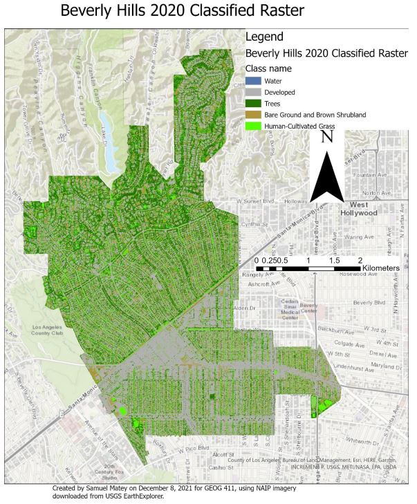 The city of Beverly Hills, like much of Southern California, is undergoing prolonged drought conditions. Xeriscaping is a water-saving landscaping method focusing on replacing water-intensive lawn grass with less water-intensive native plants. In this course research project, I asked: how much water was saved by the removal of grass in Beverly Hills between 2009 and 2020? Sequenced object-based trained classifications were conducted on two NAIP image mosaics masked to cover the area of Beverly Hills, one from 2009 and one from 2020. Subsequent calculation revealed a loss of approximately 84,863.88 square meters of grass area over this time period. Based on existing studies of the transition from grass to xeriscaping, this likely corresponds to a savings of approximately 156.4 acre-feet of water per year. Notably, this is a relatively small fraction of Beverly Hills’ water budget, with the entire eleven-year annualized change less than savings obtained in one year by other water saving metrics. This may indicate relatively low importance of grass to Beverly Hills water management and/or resistance or lack of incentivization for a xeriscaping transition among Beverly Hills’ relatively high socioeconomic status lawn-owners. My full report is below.
As one of my many coursework projects for the UCLA Master of Applied Geospatial Information Systems and Technologies (MAGIST) program, I practiced different methods of image classification. 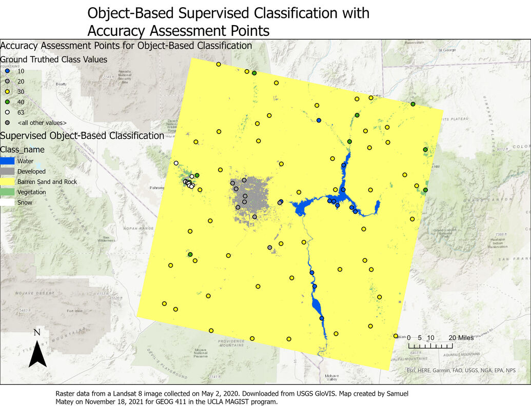 The supervised object-based classification result is considerably more accurate than the supervised pixel-based classification result. This is apparent by comparing the confusion matrices: the object-based classification result has consistent higher user and producer accuracy (i.e. fewer false positives and false negatives).
This also makes intuitive sense based on a visual comparison of the two classification results. The pixel-based classification has several other inaccuracies clearly visible just from a visual survey of the map: for example, multiple patches of sand and rock are classified as “developed”, shown on the map as wispy gray patterns distant from any actual settlement. This seems to be a somewhat “organic” error, reflecting real-world similarities as opposed to errors in training data; scrutinizing the Landsat image reveals that there are many areas of gray sand and rock, particularly dry river beds, that are extremely similar in hue to roads and other paved impervious surfaces in developed areas. That error is nicely avoided by the object-based classification. I considered and reconsidered my choice of classes for the Landsat image, opting to focus on the most clearly distinguishable aspects. The “barren sand and rock” category was so extensive, encompassing everything from gray sandy riverbeds to bright whitish sand patches to gray and ocher rock formations, that I wondered if I was making a mistake by lumping all of these features together. However, I couldn’t come up with a defensible subcategorization: the distinct land covers of snow, vegetation, human-created development, and water were clearly identifiable as separate entities, but the vegetation-free sand and rock that dominated the landscape seemed to occupy more of a spectrum, both in color and texture, in which they were more similar to each other than to any other land cover. Thus, even though it seems surprising that the object-based classification result overwhelmingly consists of the “barren sand and rock” class, I believe this is an accurate categorization of the landscape. As both the object-based and pixel-based classification use a Support Vector Matrix method for reclassification, as well as the same training data, differences between them are extremely likely to be due to object-based/pixel-based status alone. 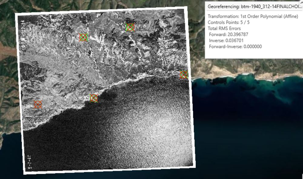 I georeferenced a 1940 black and white aerial photo of part of the coastal area of Santa Cruz Island, California, to the ESRI World Imagery (WGS84) basemap. (The photo source was the UCSB Library FrameFinder archive of historical air photos). The projection is WGS 1984 UTM Zone 11 N. In this "first try" instance, using only a simple first-order polynomial transformation, I created 5 control points (mostly targeting identifiably identical landscape features, like the base of a V-shaped intersection between two cliffs). RMS errors were unfortunately quite high, at 20.396787 forward and 0.036701 inverse. 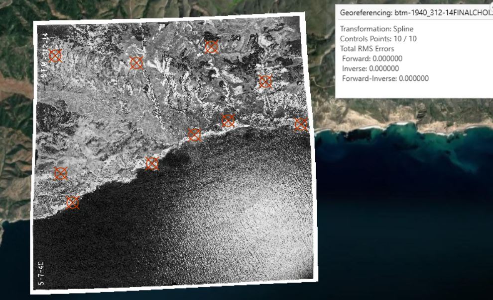 In my second step, with a more statistically robust spline transformation, I created 10 control points (again, targeting identifiably identical landscape features). Impressively, Total RMS Errors were reported to be zero, likely due to the increased complexity and accuracy of the spline transformation compared to the first-order polynomial transformation.
The spline transformation result appears substantially more visually accurate. Using the Swipe tool to view the first-order polynomial transformation reveals several slight “offset” errors, but the spline transformation appears seamless, as can be expected from the difference in total RMS errors. As Esri describes it, the spline transformation uses “a piecewise polynomial that maintains continuity and smoothness between adjacent polynomials” and optimizes for accuracy nearest control points. Here, it appears highly effective |
|||

 RSS Feed
