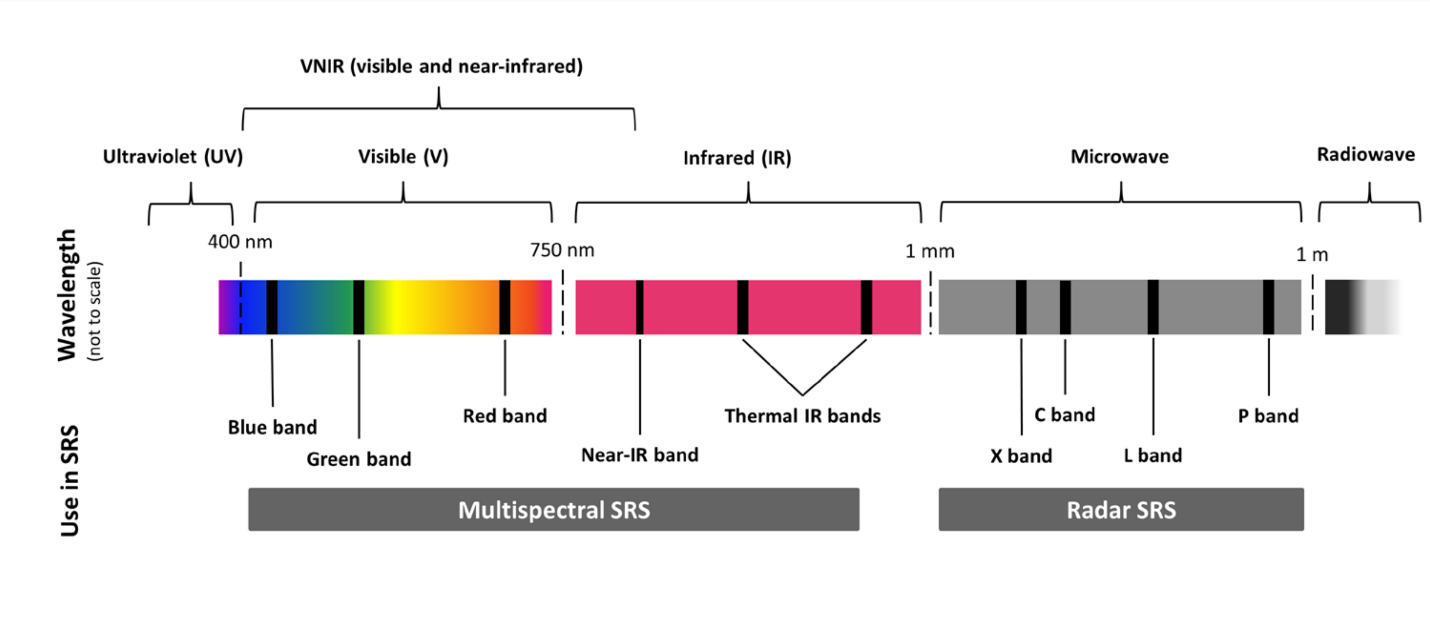
 Since September 2021, this writer has been enrolled in the all-online Master of Applied Geospatial Information Systems and Technologies (MAGIST) program at UCLA. Geospatial information systems (GIS), essentially mapping and analysis of all data with a physical location attached, is a key field for understanding and influencing the changing world of the Anthropocene, with potential applications ranging from siting new renewable energy projects to researching temperature, moisture, and biodiversity shifts in ecosystems. As my coursework continues, one project in particular showcased key concepts from satellite imaging: spectral bands and spectral indices. Earth observation satellites (in this example, the latest in America's venerable Landsat program) host instruments that observe, record, and measure light from Earth in specific regions or "bands" of the electromagnetic spectrum. The schematic above shows several commonly observed bands: red, green, and blue in the visible spectrum. 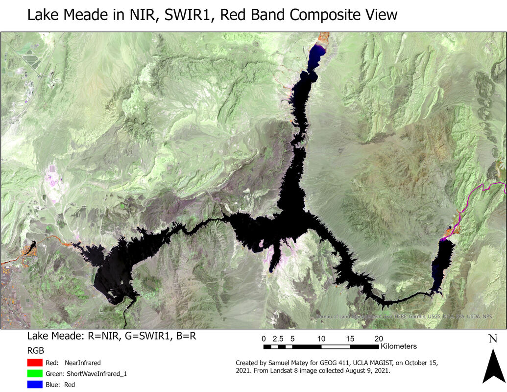 The map above is a false-color satellite image of Lake Mead, formed by the Hoover Dam and the largest reservoir in the United States. The map above looks weird because it's showing light from the Near-IR Band, which human eyes can't see, as red, while showing light from the SWIR1 (Short Wave InfraRed 1) band, one of the two "Thermal IR Bands" on the spectrum schematic above, as green, and finally showing red light as blue. This sort of thing is helpful because different wavelengths of light show different things: for example, due to the physical properties of the chlorophyll molecule, living vegetation is bright in green wavelengths of light (as we see) but is really bright in the near-infrared, so living plants pop out unmistakably if the NIR band is viewed as red on a map. In this case, the band combination was chosen to emphasize the difference between land and water. 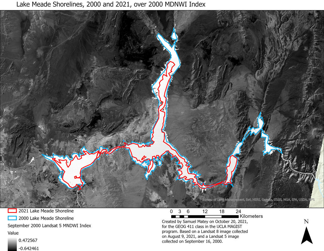 The maps above and below takes it a step further, by using a spectral index, where some math is done to the results of information from different spectral bands to show new and interesting things. In this case, the project used the Modified Normalized Difference Water Index (MNDWI), the equation for which uses the green and thermal infrared bands to calculate a light pattern that enhances the distinctions between water and land even more. In this case, I looked at Landsat images from 2000 and 2021, applied MNDWI to both of them, and did an approximate tracing of the lake's coastlines in both years. (Measurements of water/land boundaries, no matter how good, are only ever better or worse degrees of "approximate," never exact, due to the coastline paradox). 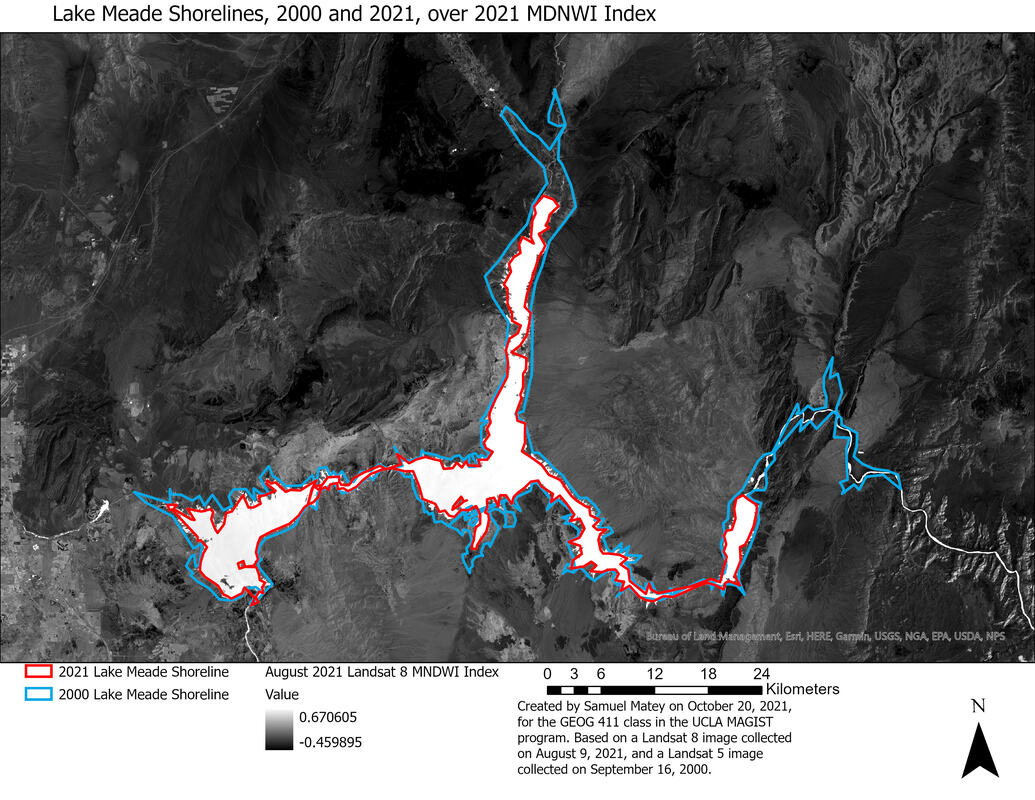 These maps rather clearly show a disturbing consequence of the climate crisis, made worse by mismanagement (particularly overuse by profligate local agriculture) of the Colorado River watershed. Lake Mead is shrinking, profoundly and rapidly. It's now at only 36% of its historic capacity, and rationing, the first ever, will go into effect (for industry/society sectors as a whole, not individual consumers) in 2022. NASA's explainer uses a very similar visualization to the map above. This example is fairly simple, but it's a good illustration of how satellite imaging, and playing around with different sorts of light, can be a source of valuable insight in the Anthropocene-likely a recurring theme in future research and reporting!
0 Comments
Blue Tech Clusters of America Story Map, created as a project under the aegis of SustainaMetrix, commissioned by The Ocean Foundation. I did all data visualization and mapping for this project. Note that it is cited as authoritative by the federally-funded MIST Cluster at the base of their homepage! Here's a link to the full Story Map in a web browser.
Blue Tech Clusters in the Northern Arc of the Atlantic Story Map, created as a project under the aegis of SustainaMetrix, commissioned by The Ocean Foundation. I conducted all data visualization, as well as considerable original research, for this project. Here's a link to the full Story Map in a web browser.
A quick PowerPoint on my view of the state of the geospatial field, as of mid-October 2021.
Basic relational geodatabase and documentation.
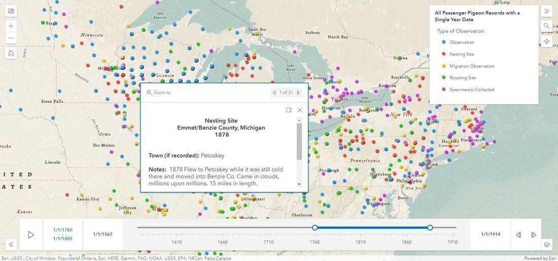
In partnership with Ben Novak of Revive & Restore, the world's first de-extinction biologist, I created the first-ever interactive map of all known historic passenger pigeon records.
The image above shows it in use, with the time sliders covering a 1760-1885 range, the legend in the upper right corner folded out, and a nesting site record in Petoskey, Michigan clicked on. Here's the link to view it in a browser window. Note the adjustable time window (it starts set to only records from 1567) that allows the user to look at passenger pigeon records from any period! Move the blue dots apart to move the time window. 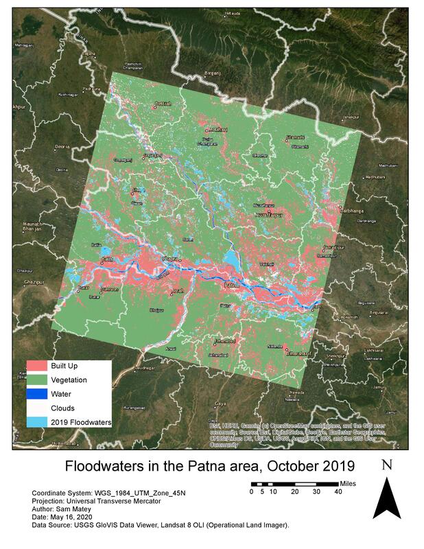 In this project, I wanted to ascertain the extent of floodwaters near the city of Patna, in the Indian state of Bihar, in October 2019. (For more on this flood, see www.forbes.com/sites/lauratenenbaum/2019/10/15/climate-change-impacts-monsoon-flooding-in-india/). I used the USGS GloVis viewer to download two Landsat 8 raster images for an identical area including the city of Patna, from October 2015 (a time where there was no major flooding in the area) and October 2019. Notably, I made sure that these rasters were identical in their area coverage. I endeavored to find a closer chronological match for the pre-flooding raster, perhaps October 2018, but was limited by the need to find rasters that had reasonably low cloud cover. My question was “Which parts of the water-covered areas seen in the October 2019 raster are the result of floodwaters, as opposed to being normal for that time of year?” To answer this, I ran a supervised (trained) classification on the October 2019 raster, with four classes: Built Up (including everything from the urban center of Patna to villages), Vegetation (forests and agricultural land), Clouds, and Water. I then ran a Maximum Likelihood Classification, resulting in a classified raster. After noting some discrepancies, I changed several of my training samples and ran a new, more successful, Maximum Likelihood Classification. I then ran a Raster to Polygon tool, set to create multi-part polygons, and used Select by Attributes to extract the Water class as its own file. I then repeated this sequence of Maximum Likelihood Classification, Raster to Polygon, and Select by Attributes (extracting the water polygon) for the October 2015 raster. Notably, I used the same signature file I had created to train the classification of the October 2019 raster on the October 2015 raster, to ensure that the same pixel reflectance values were assigned to the same categories in both classifications. At this point, I had two polygons: one showing all water in the area from October 2019 and one showing all water in the area from October 2015. I used the Erase tool, with the 2019 water as the input feature and the 2015 water as the Erase feature, to return a polygon depicting all water that was present in the area in October 2019 but not in October 2015. (In total, seven geoprocessing steps were run in this analysis: two Maximum Likelihood Classifications, two Raster to Polygons, two Select by Attributes, and an Erase). These were, to a rough approximation, the floodwaters. I found that this covered a substantial area, visually indicating the abnormalities caused by the October 2019 flooding. I then created a model of this analysis process, with Pre-Flood Raster, Post-Flood Raster, Signature File, and Selection Expression as inputs. For any two rasters depicting the same area before and after a flood, this pattern can create a simple visualization of the extent of the floodwaters. Notably, the Selection Expression should be written down beforehand. My expression happened to be “gridcode=65,” based on the water samples in the signature file, but this will vary from analysis to analysis. I was quite pleased with the results. By overlaying the “Floodwaters” raster on the October 2019 classified raster, the extent of the flooding is very clearly visible. Adding a basemap allows direct comparison of flooded areas to on-the-ground localities, potentially making this analysis very useful for resource and aid distribution in the immediate aftermath of widespread floods. Particularly in parts of the world with poor communications or infrastructure, this kind of analysis could unveil underserved areas. One potential limitation is cloud cover-I selected two rasters with low cloud cover, but clouds covering varying parts of the area did add some uncertainty into the analysis. A potential follow-up analysis would be to find census data for the areas covered by floodwater, and calculate how many people were displaced by the floods.
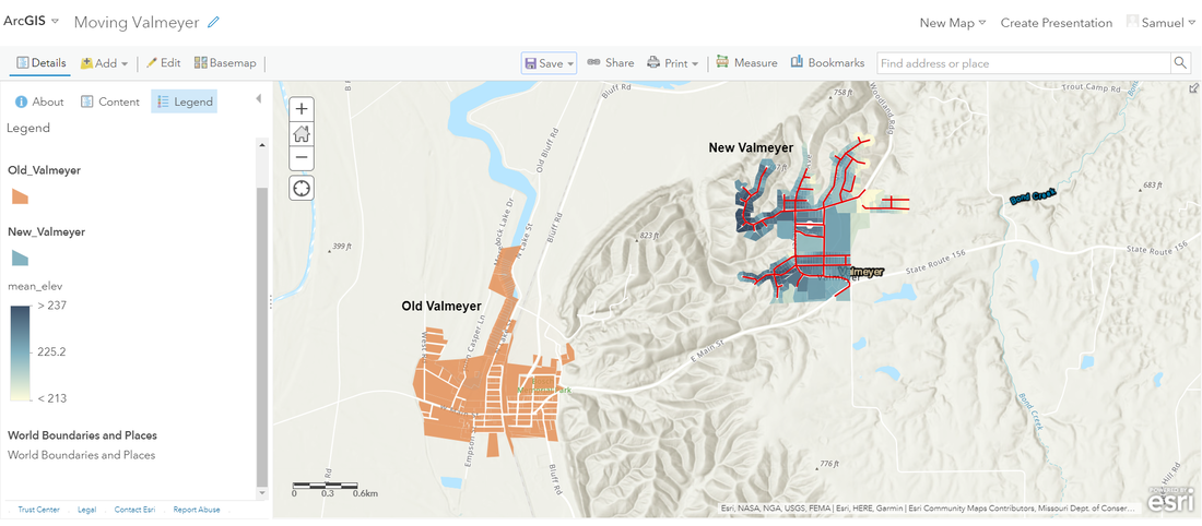 In this GIS learning assignment, I digitized roads and property data for the new site of Valmeyer, an Illinois village which was relocated to avoid Mississippi River flooding.
|
|||||||||||||
 RSS Feed
